
Where does your quilting inspiration come from? There are so many wonderful places to draw creativity from. We can pull from our experiences, travels, nature and our daily life. With so much information on the internet, we are never short of seeing inspiration from others via blogs, instagram, other photo sharing sites, and Pinterest.
But where does the inspiration begin? A photo? A color? A quilt block? The answer may change with each project.
I enjoy finding inspiration at color palette websites. Have you tried it? Color palette websites are based on gorgeous photography. The photos are shown with the major corresponding colors pulled out of the photo and listed next to each other in a paint chip-like swatch. I love to peruse palette websites, looking for a series of colors that Wow me and would look good in my next quilt.
Here are a few color palette sites I found:
Design Seeds
Color Palettes
In Color Balance
Akula Kreative
I hope you find some inspiration here and check out some of the color palette sites next time you sit down to make your next quilt.
But where does the inspiration begin? A photo? A color? A quilt block? The answer may change with each project.
 |
| Strawberry Brights from design-seeds.com |
I enjoy finding inspiration at color palette websites. Have you tried it? Color palette websites are based on gorgeous photography. The photos are shown with the major corresponding colors pulled out of the photo and listed next to each other in a paint chip-like swatch. I love to peruse palette websites, looking for a series of colors that Wow me and would look good in my next quilt.
Here are a few color palette sites I found:
Design Seeds
Color Palettes
In Color Balance
Akula Kreative
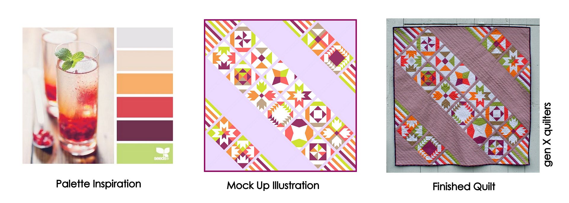
Using a Color Palette Image to Inspire Fabric Choices: Here is an example of how I used a color palette image in a quilt. This Vice Versa quilt was originally designed using greens, yellows and blues. The palette was harsh, but it helped me decide what quilt blocks I wanted to include in the Sampler. After the blocks and layout were decided, I was in need of some color inspiration. I turned to Design Seeds to find the right palette for this quilt. On the left, is the Color Sip image from Design Seeds. I mocked up the quilt using this soft palette of putty, dreamsicle orange, coral, plum and green apple. I liked this look and was able to choose a similar palette of solids to make the actual quilt.
Using a Color Palette Image to Inspire Fabric Choices AND Quilt Design: This color palette image influenced both the quilt design and the color inspiration. I found this Pigmented Palette image again at Design Seeds. The image evokes a strong southwest feel for me. I kept picturing a quilted version of a totem pole in my head. I wanted to use a quilt block that could represent that notion to form the layout for the quilt. This quilt, Moccasin, is based on the X&+ and Sister's Choice quilt blocks. The individual sampler blocks fill the totem pole. The color palette pulled from the image spoke strongly to me, but I decided to change the blue hue from aqua to midnight blue. This makes me think the quilt shows itself against the night sky.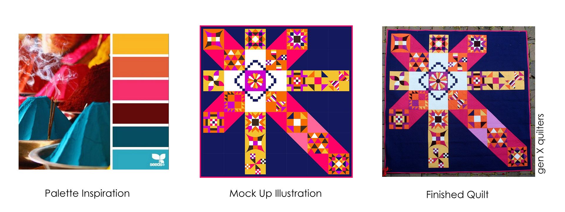
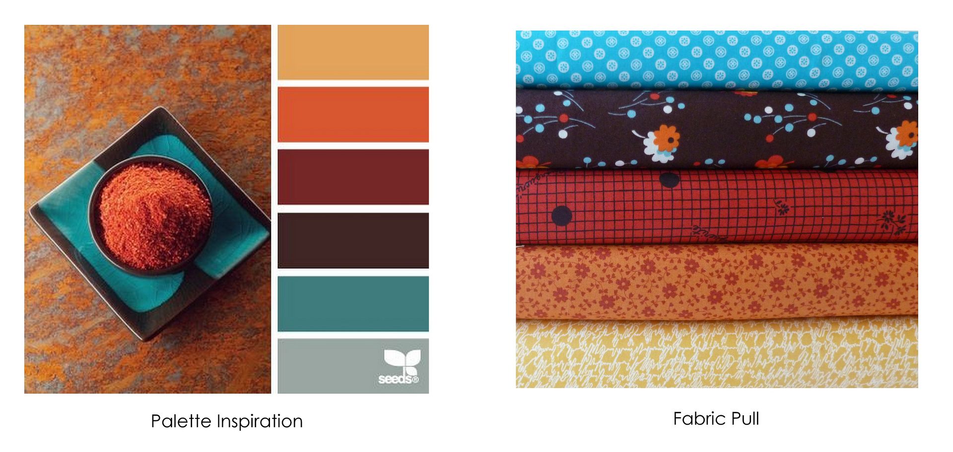
Are these palettes just for Solids? No way! I chose to use solids in the two examples above. That is simply my choice - I love the way the block shapes really stand out when pure colors are used. But don't think you are limited to solids when using palettes as color inspiration sources. Below you can see a bundle of prints that I put together to coordinate with the inspiration photo Color Spice (fabric photo courtesy of Sew Me A Song). Just use the photo and palette as a starting point...
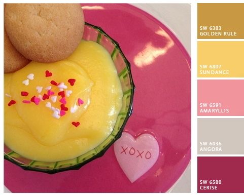
Create your own palette: Say you have your own photo that inspires you. It would make a perfect color palette if only you knew how to do it. No problem! Check out Chip It from Sherwin-Williams. You can instantly turn your photo into a color palette using over 1,500 of Sherwin-Williams paint colors. Pretty clever, huh? Here's a photo from my Instagram feed of Valentine's day pudding that I tested out with Chip It. Wouldn't that make a pretty quilt?